Simplify Before Committing
Back in the day, when I quizzed established artists about best practices towards making art full time, the sculptor Ron Pekar gave me a great tip. He suggested limbering up by painting small studies in watercolor as though they would be cut into simplified wooden puzzles.
Ron said beginner painters want to paint every leaf, branch and flower on complex landscape scenes, because we don’t trust the viewer to fill in the missing shapes.
New painters want to copy detail, instead of painting a scene artistically, because we haven’t practiced editing, which is key to moving away from documentation and towards mature, painterly mark-making.
When you find a complex scene appealing, make flat color-block and value studies. The scene will still be recognizable, with very little detail. Trust the viewer to understand the setting.
A simplified practice version of your subject will remind you to lay compelling but unfussy color passages in the final, larger painting. Give your viewers’ eyes a place to rest.
One Art Lesson – Multiple Uses
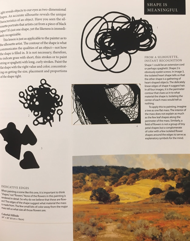
Ron’s advice is echoed in Kevin MacPherson’s great book Landscape Painting, Inside and Out (see a page snapshot above) I’ve found this simplified block-painting practice to be very useful for printmaking too.
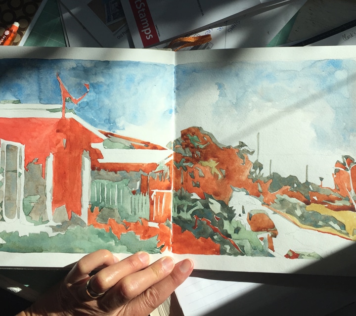
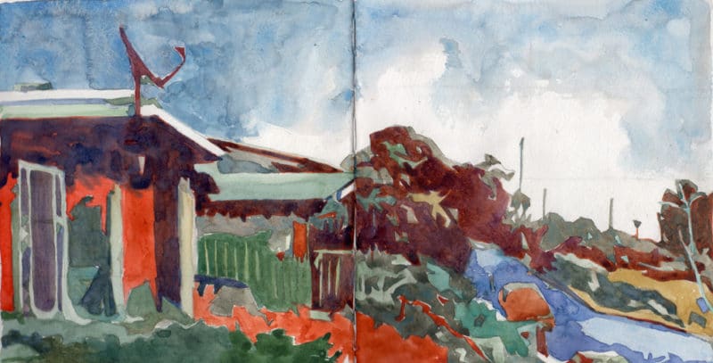
Ron’s tip to simplify the scene is so helpful with this landscape view, because it’s complicated (below) by staggered depth, textures, and foliage.
I’ve reversed the composition, to discourage my attempt to document, instead of paint, and because it will print in reverse if I make a relief or intaglio print from the sketches.
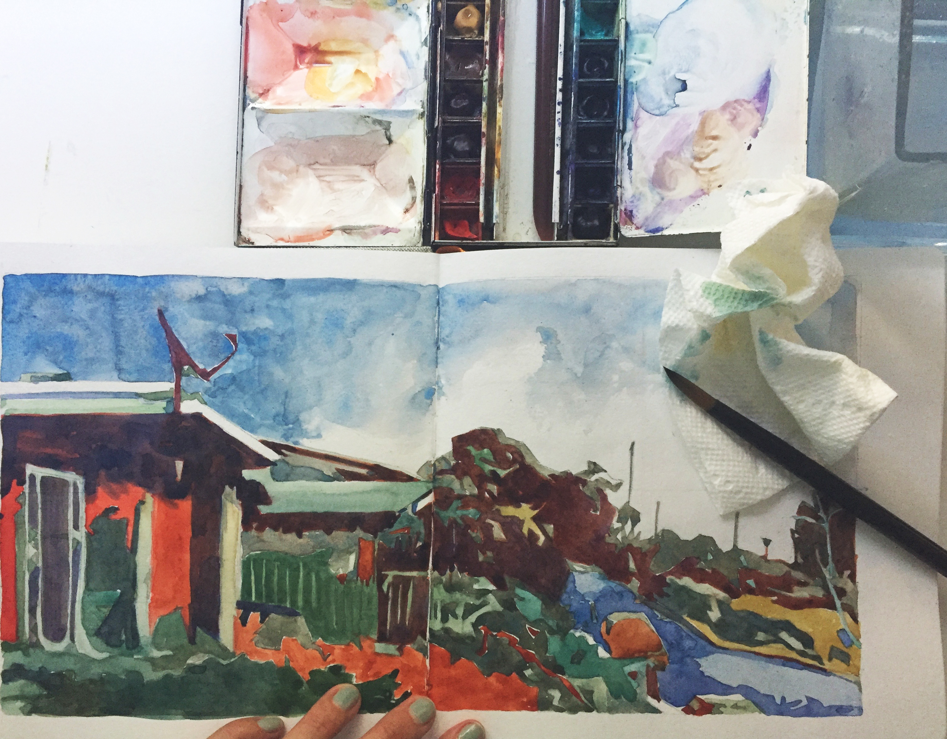
I started with a flat set of two colors; orange and sage green (see the first in-process image above), and later, added a darker plum to delineate shadow shapes. I still have to decide if this should be a linocut, or collagraph, or a drypoint. Which media do you think fits this little landscape the best?

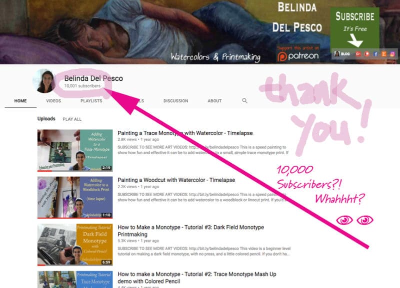
Art Party for 10,000
The reference for this study is the home of my favorite one hundred year old neighbor, who sadly passed away a few months ago. 🙁 She lived in the house since 1955 and her wind chimes hanging from the eaves have been the soundtrack to our neighborhood on breezy days.
Her kids gave me the chimes last week. I’m very moved to hang them up and continue her tradition of chime-twinkles.
On the subject of preserving precious friendships, I appreciate the connection I have with every one of you.
Whether we know each other from this blog, or YouTube, or Instagram, or Facebook, or Pinterest, or down the street in my neighborhood.
I’m sending you a heartfelt, tall person, bear hug. You are awesome, and I’m so glad to know you. Yes, you.
Can I be Sentimental?
Making things with your hands takes a lot of planning, focus, and alone-time.
That’s a good thing, but in order to share the work, or teach process, artisans traditionally had to leave their studios, load their gear into something mobile and hit the road.
I’ve done some of that with art festivals, and it can be disruptive and exhausting work.
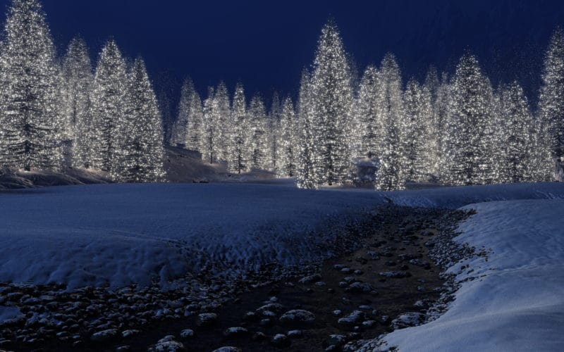
Sharing steps and results from my studio, via the internet, is like plugging miles of twinkle lights into electricity. The lights are woven through a global forest, so each time I post something, all the lights flicker awake and I’m shaking hands and greeting every like-minded, enthused, creatively-charged and ready to make-stuff person – and we are connected, instantly.
AND, we all get to keep working! If I stopped to travel, or teach, or sell face to face, I’d never be able to keep up.
Thank you for being one of the shimmering twinkle lights in my forest network of art friends.
Your feedback, comments, suggestions, encouragement and sharing of your own artist’s journey makes the whole forest bright, as far as the eye can see. Let’s all keep in touch.
Thanks for visiting today, and I’ll see you in the next post!
Belinda
P.S. You can subscribe (it’s free) to get these missives in your email by signing up here.
Art Quote
Do stuff. Be clenched, curious. Not waiting for inspiration’s shove or society’s kiss on your forehead. Pay attention. It’s all about paying attention. Attention is vitality. It connects you with others. It makes you eager. Stay eager.
Susan Sontag
I echo the sentiments of the other commenters regarding no surprise re your 10,000 followers, being a twinkling light, and sincere appreciation for your virtual mentorship – this wooden puzzle piece tip is gold to me. I vote for a collograph, but whatever you choose, I’m sure the finished product will be wonderful! Thanks again for guiding and cheering us on!
Hi there K, Thanks for your visit and your feedback. I’m so glad you’re finding these missives useful! Anything that keeps us reaching for art supplies is a good thing, right? And thanks for your compliments. Cheering you on is one of my favorite things to do. I’m talking to myself as much as I’m sharing the pompoms and cheerleading with all my friends. Here’s to an engaging, productive winter season of art making!
Belinda, I’m not surprised that you have so many followers! I have been a fan of yours for quite some time now. I love thinking of my self as one of the twinkling lights in your forest. I have one of your paintings hanging where I get to see it everyday.
I love the ideas you presented in your simplify before committing paragraph. Brilliant… easy to apply, and solves a difficult problem. Keep doing what you do and know that you inspire all of us in a gazillion ways!
Congrats!
Marilyn Thuss
Hi Marilyn, Thanks for your vote of confidence. I’ll be surprised enough for the both of us! And you are indeed one of the twinkling lights in my forest! I’m glad the simplified puzzle painting was helpful, and I hope you enjoy playing with it in your preliminary sketches and studies. Thanks for your continued support and encouragement! 🙂
Your blogs continue to be always so inspiring, informative and ever so welcomed in my in-box. Here’s “blinkety-blinking” at you from my little corner of Atlantic Canada. As in the words of the song: “It’s a small world after all!”
Dear Blinkety-Blinking – I’m blinking back to express my gratitude for your long distance camaraderie through the net. Sending California sunshine your way this minute…. 🙂
Belinda … congrats! I told you about visiting a studio on a tour here a while back in British Columbia and happen to ask the artist if he knew of you and he said Yes! – great fun, but not all that surprising. Yours is my favourite blog!!
Question: I see you painted the lovely cottage red using the Winsor-Newton Cotman palette. I use that kit for my journal and have been mixing the ‘cad red pale hue’ with the ‘alizarin crimson’ to get that fire engine red. Is this what you have done to get the truer red (not orange)? I have thought about substituting a cad red medium for the cad red pale hue – knowing I can mix an orange easily from that palette. Have you substituted colours in some of these pans? I like the size of the little kit and I like mixing, and would love your advice…
I love the puzzle idea and it is the perfect lesson for me just now, so will try it – thanks!
Mary
Hi Mary,
I’m so glad the puzzle exercise spoke to you. I find the process very helpful on complex or layered scenes, so I hope you have fun testing it! On my little cotman travel palette, I swapped all the colors that came with it for tube colors. I thought it would be fun to test colors I don’t always use, so they’re random. The two reds in that palette are Antique Red Orange by Holbein, and Sennelier Bright Red, and the yellows are Winsor Newton Yellow Ochre and Daniel Smith Gamboge. And I’m glad we have a common friend up in British Columbia! More twinkle lights in our grand forest!
Great Post again thanks…Re the red house, personally I’d do a Linocut because I’m more confident with the medium, but your Collagraphs are so good that might suit you better! ?
Hi Drusilla,
Thanks for the feedback, and you’re right that the image would lend itself to either a linocut or a collagraph. I’m still undecided… but I’ve taken a pile of photos as the house will be on the market soon, and new owners are likely to make changes, so I better get to it!