Values in Watercolor Painting
For folks new to values, we’re referring to the gradation between dark, mid-range, and light shades in a value scale.
We’ve all seen and/or practiced values in black and white drawings and monochrome paintings. But translating value from black and white to full color demands a little practice (and a lot of squinting).
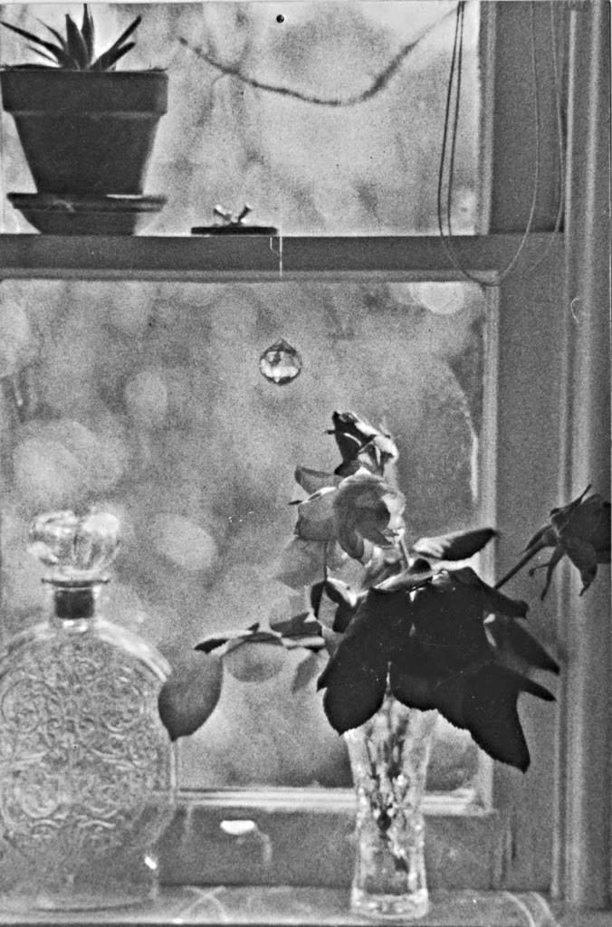
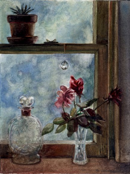
Many new painters use color in their work, with not enough attention to values. For this exercise, use the black and white photo (below) as a value map, and paint a color version of the same scene.
Darkest Darks, Lightest Lights
Squint frequently to ensure the darkest areas in your painting match the darkest areas of the photo. Look at your mid-ranges to match or synch them with the mid-range values the photo. Your lightest lights map to the same bright spots in the reference photo.
This value exercise gives you lots of room to play – both with your color choices, and mark-making style.
When you’re almost finished with your painting, snap a photo of your work, and use imaging software to look at it in black and white.
Compare the monochrome photo of your painting to the reference photo, and this will help you see if your values are accurate.
Make adjustments on your painting where necessary, and scan or photograph your finished results to post on the DPW Challenge page.
We look forward to seeing the full color posts of your work!
Value Tools for Watercolor Painting

There are some tools to help you see values in your work. You can buy a black and white value scale like this one at Dick Blick.
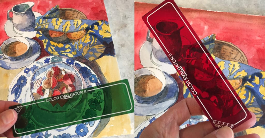
Years ago, a friend gave me a red acetate val-u viewer (below). It was a revelation to me for seeing values in my paintings.
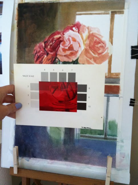
They aren’t made any more, but this Red and Green Viewing Filter is even better.
I found the tools above (and squinting a lot) enormously helpful when I was trying to get my head around values in watercolor.
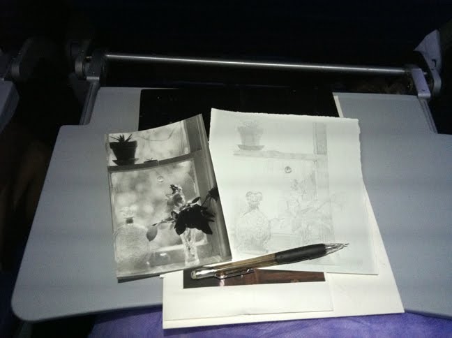
Mapping Values in Pencil
On a plane, headed back to Los Angeles, sketching the window from my reference photo.
The graphite is my under painting and value plan, based on the values in the photograph. The darkest parts are the clay pot cactus on the upper sill, the neck of the whiskey bottle, and the leaves & parts of the flowers in the vase.
The mid-range values are around the frame of the window, the lower parts of the glass vases, and through out the lost-edges of the marble pattern on the window glass looking outside.
The lightest areas are crescents and slivers of light in the suspended crystal hanging in the window, the stopper in the whisky bottle, the sloped crown of the lower window pane, and dots & dashes of light in the flower petals.
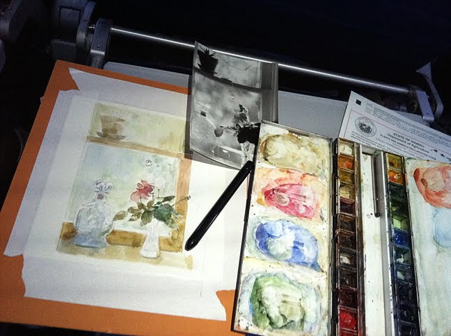
Watercolor Glazing to Control Values
Starting to add thin glazes of watercolor to test harmonies and plan my darkest darks, painting around my lightest lights.
If you’re working in acrylics or oil paints, you can create an under painting in just three values – dark, mid-tone and light – using one color in various transparencies.
Take a look at what the incredibly talented painter Karin Jurick has done here, and then start adding colors making sure to stay within those values.
Daily PaintWorks Challenges
This is the Daily Paintworks challenge this coming week. Value Challenge: Black & White to Color (You don’t have to be a member to participate, and it’s free).
For this challenge, use the black and white window photo at the top of this post by clicking on it, and then drag the full size version to your desktop. (It’s grainy, but that’s good, because you won’t be tempted to focus on details over values.)
The challenge is to paint a color version of this image – in any color harmonies you’d like, but keep the values accurate.
Thanks for stopping by, and I’ll see you in the next post!
Belinda
Art Quote
Kevin Machpherson, Landscape Painting Inside & Out
Hue is the name given to a color. Value is how dark or light that color is. They are inherently related, and it is vital to be conscious of both. So, val-hue is the term I have coined to describe these combined qualities simultaneously. Together, value and hue – val-hue – create mood, define form, create illusion of space and indicate the source of light. Values in a painting create a two dimensional pictorial design regardless of subject matter. A strong painting is often an arrangement of a few simple shapes of different values. This arrangement of values, if done right, can attract viewers to a painting from across a gallery. If the values in a painting are correct, the color will most likely work, but color cannot save a painting with incorrect values. Painting is a study in relationships. Comparing each value to the others – considering not just hue, but val-hue – is a must.
Belinda – I tried to find the maker of your value viewfinder and all I can come up with is a lawyer who specializes in DUI. Does he also make these up, do you think? Thanks for sharing your process… Lovely painting!
So romantic! I chose this as my favorite painting today on Rosa’s Picks! I hope you’ll come by and check it out. Thanks, Rosa
Ok I’m very pleased with myself I see we have the same wc palette and same mechanical pencils HAHAHA! Always happy to be a little bit more associated with my B! I love that painting it’s so sensitive in its delicate state it made my eyes a wee bit misty xox
Your painting came out awesome, Belinda. May I ask, when you do your graphite sketch, do you add some sort of fixtive to the sketch before adding the watercolor? I would be afraid the graphite would bleed with the color and look smudgy. It is such a detailed sketch and done so beautifully.
Love it 😉