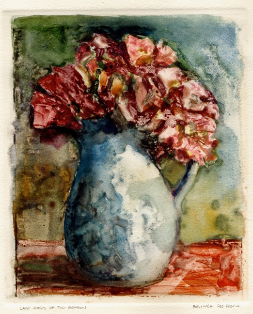
Last Roses of the Season 8.5 x 7 Monotype on Arches Cover paper
Available on Etsy. Sold
Making a Light Field Monotype With Watercolor
Fall is here in the California desert, with squinty-bright light, cool mornings and scattered leaves. The very last roses in my garden are wind-blown and crumpled, but I’ve been bringing them inside just the same, to collect their breathy, floral scents, and stand them up in a small ceramic pitcher my great grandmother made.
Sharing Tips from other Artists’ Studios
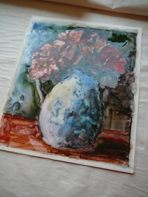
I mentioned in my last post that my amazmo-artist friend Priscilla Treacy suggested that I’d get more pigment to release from the frosted mylar plate if I coated the surface first with gum arabic, so I did that – very diluted and coated in thin layers – the night before. I also put just a drop of gum arabic in my rinse water before I started to paint this loose rendition of my garden roses.
What Makes Monotype Printmaking Distinctive?
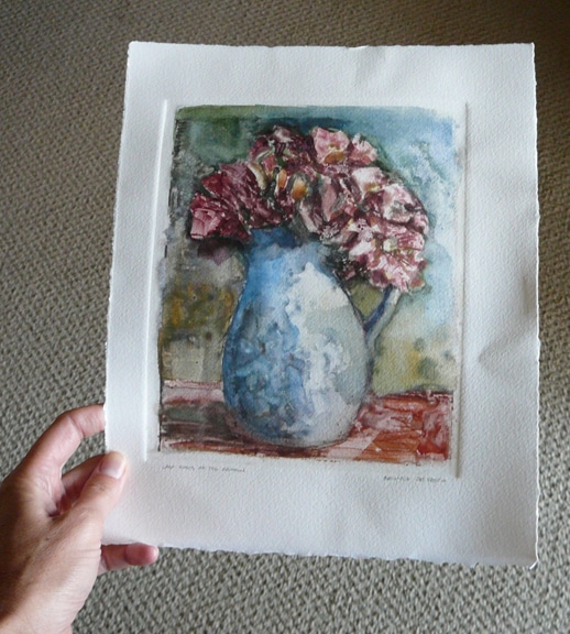
I love the painterly affect you get with this type of printmaking. There is no carving, no gouging, and no building up of the plate. I also think it’s excellent for the way monotype almost demands a loose approach, even if your (my) tendency is to be tight and more illustrative, the resulting monoprint is so much more exciting to gaze at with all that fluid mark-making and random pigment colors bumping together under the pressure of the press. I think I need to make another one immediately. 🙂
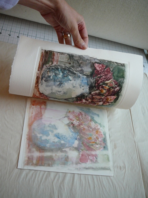
I was really pleased with how well the pigments released from the mylar in this one. The gum arabic definitely worked, and I also love the way the brush marks and scumbling I did with my finger tips on the wet pigments stayed in pattern on the print.
If you’re interested in making a monotype, I have a few tutorials on my youtube channel (you can check those out here) that feature dark field monotypes and trace monotypes. Have a look, and let me know in the comments if you’d like to see a light field monotype like this one demonstrated in a video tutorial.
Thanks for stopping by today, and I’ll see you in the next post!
Belinda
You can subscribe to this blog, and get each new post via email by signing up here. 🙂
Art Quote
Frank Benson and Edmund Tarbell (and often Joseph DeCamp) were invariably identified as a subgroup within the Ten American Painters. At least one critic noted the lack of Impressionist elements in their first submissions to the Ten’s group shows. “Tarbell has recently suffered something like an eclipse of light and color. Several years ago both (Benson & Tarbell) were producing strong and spirited work, but just now, they seem to be wandering in dusky light, using washed out hues and questionable charm.” Benson’s response to this criticism was to submit to the Ten’s exhibitions a flourish of outdoor pictures of his family basking in the summer sun in fashionable white attire. Tarbell responded with a group of Impressionist paintings (through 1906) but then suddenly turned away from these outdoor pictures to concentrate exclusively on interiors and pure portraiture. Interestingly, most of the final works of Tarbells’ peak Impressionist period were exhibited with the Ten, and all were portrayals of family members in outdoor settings.
~Laurene Buckley, Edmund Tarbell, Poet of Domesticity
Truly beautiful and a great tip about the gum arabic. You never cease to inspire.
The textures and colors and shapes – all so wonderful!! Wow.