What is a Monotype Print?
Monotypes are a very painterly form of printmaking. There’s no carving into the plate, no materials glued to the plate, and nothing applied to the plate’s smooth surface, beyond pigment.
Monotypes are made by manipulating pigment alone on a smooth plate, and then pressing it against paper to transfer the image.
Inks can be rolled on the plate for full coverage with a brayer, and then removed with q-tips and scrapers to create an image in a subtractive process. This is called a dark field monotype, since you’re starting with a completely covered (or dark) plate.
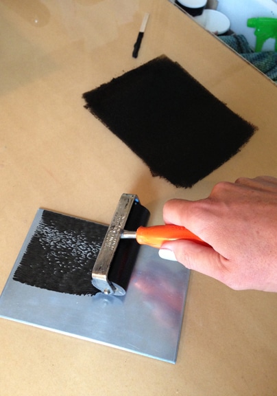
Dark Field vs Light Field Monotype Prints
You can also paint your image on the plate in a direct, additive manner, which is called a light field monotype. Dark field monotypes are (generally) single color, and light field monotypes can be either monochrome, or painted with a full palette of colors.
In both versions, while the pigment is still wet, a soaked and blotted sheet of printmaking paper is pressed against the ink, to transfer the design to paper.
I’ve seen artists create beautiful full color light field monotypes by painting with thinned oil paints on a sheet of glass, and then hand pressing watercolor paper onto the wet pigments to transfer the imagery.
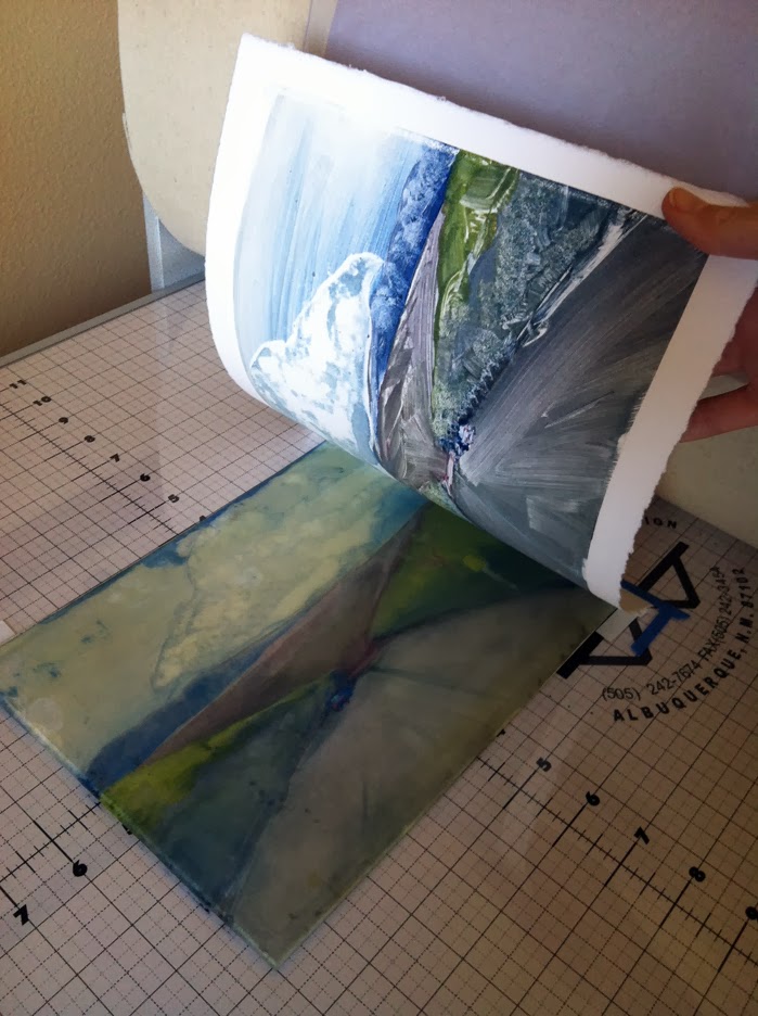
You Only Get One Monotype
On all monotypes, once the image in the ink looks the way you want it to on the plate, soaked and blotted printmaking paper is laid on the still-wet pigments, and pressure is applied to transfer the ink from the plate to the paper. This is called a monotype. The root of the word “mono” refers to to the fact that you usually get just one print.
There is no repeatable matrix, or incised marks on the plate that you can edition in subsequent prints. (If there were any lines or marks etched into the plate, creating a recognizable, repeated pattern, the resulting prints would be called monoprints, not monotypes.)
Let Your Art-Control-Freak Go
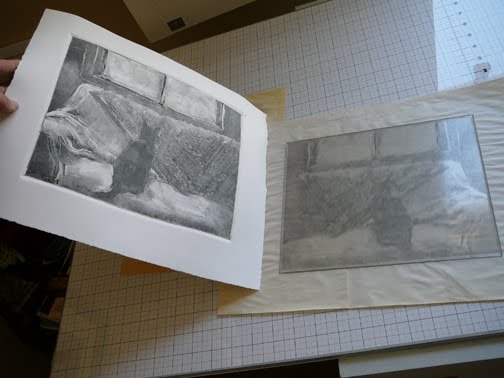
In either dark field or light field monotype printmaking, the pressure of the transfer usually alters your careful mark making in the inks, and reveals all sorts of surprises in the print.
Monotype printmaking will totally wrinkle the rug under your inner control-freak. No matter how careful you are with ink placement and removal, the pressure of the press will have its way with the art, altering your deliberate, controlled plans.
But fear not, because the beautiful lessons in that process are served on visual platters of delight. You blink a few times, let go of your expectations, and soak up the new, surprisey goodness in your pulled print.
How to Color a Monotype Ghost Print with Colored Pencils
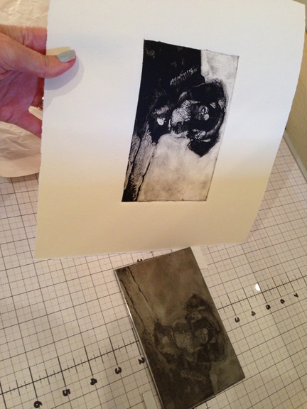
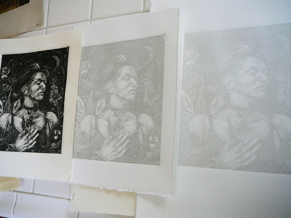
In the image above, you can still see a faint film of ink from the dog portrait rendered on the zinc plate. A second sheet of soaked and blotted paper can be laid on that thin layer of left-behind pigment, and run through the press again, to pull a ghost print.
Monotype Ghost Prints are the fair pigment cousins of monotypes. Ghost prints are one of my favorite offshoots of this printmaking method, because the tonal variations in each print are wholly different from their saturated parents. Ghost print monotypes are perfect leaping off points for other media.
Want to learn more about Monotype prints? Join this All About Monotypes Group to share and discuss various monotype methods on Facebook.
Adding Media to Monotype Ghost Prints
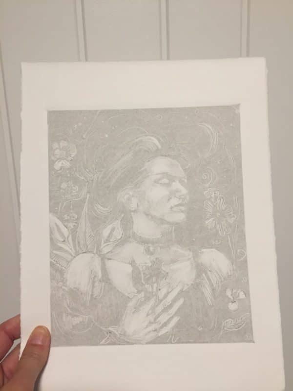
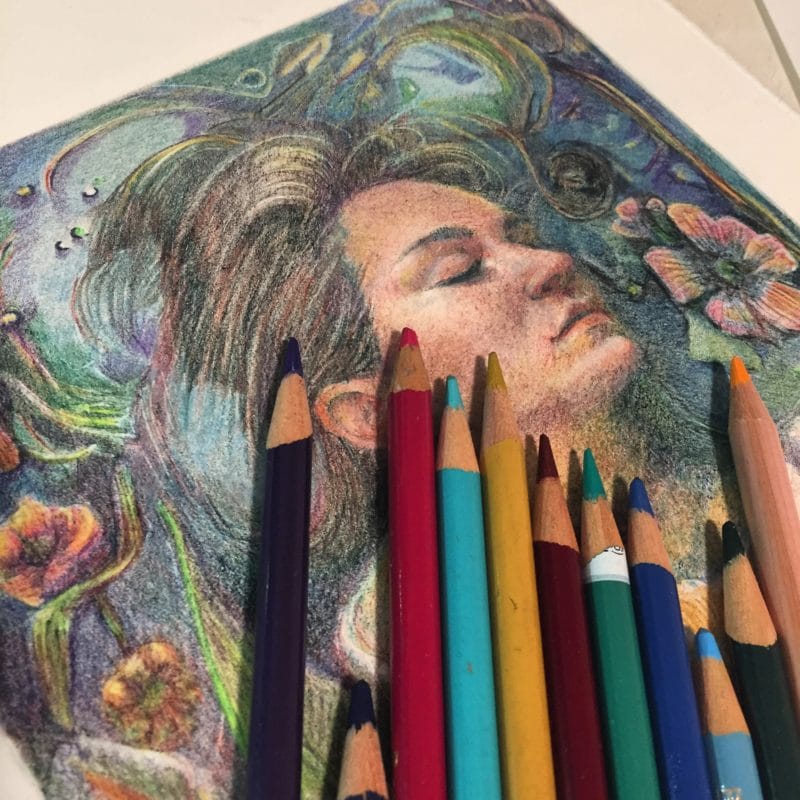
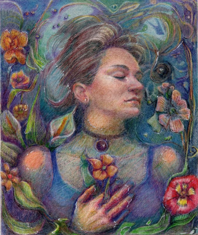
The art in this post – Untethered Cultivar (cul·ti·var – noun BOTANY – a plant variety that has been produced in cultivation by selective breeding.) – started as a very faint monotype ghost print. The monotype was inspired by Ophelia in Shakespeare’s Hamlet.
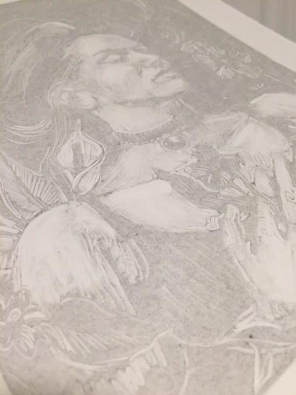
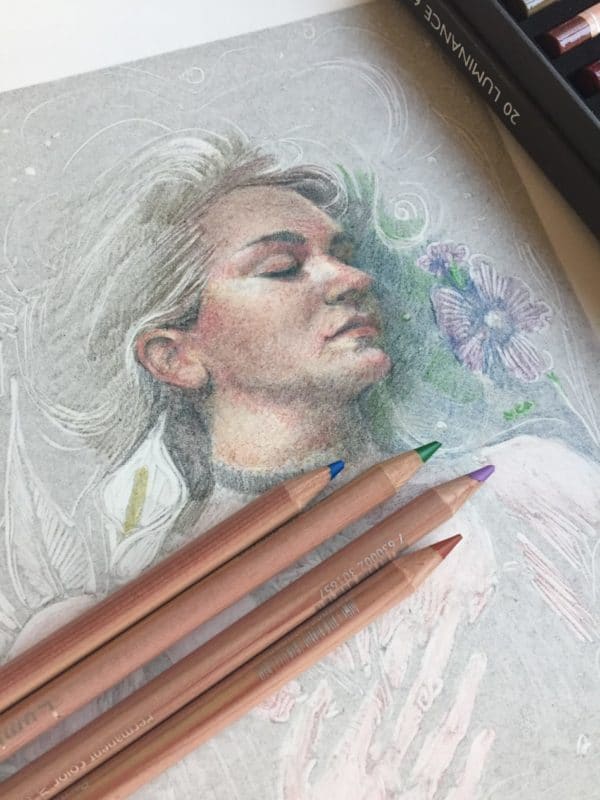
The beauty of a monotype ghost print is in the subtle halftones, and surprise value shifts. The ink is often so light, the ghost print offers an underpainting, or a grisaille to use as a leaping off point with other media. And so much of the paper is still exposed under that trace of ink, you can add watercolor or colored pencil, depending on the paper you printed your ghost print on. You can add any media you’d like to enhance details or increase color to a monotype ghost print!
The ghost print monotype in this post was printed on a beautiful, smooth, bright white paper called Arches 88 printmaking paper.
Arches88 has no sizing in it, so wet pigments like watercolors or Dr. Ph. Martin’s inks would bloom, spread/sink through to the back of the paper, as if I were painting on a paper towel. So I started working on this ghost print with colored pencils. Arches 88 is *lovely* paper for hand-printed (no press) ink or oil-paint monotypes. Dry pigment enhancements adhere beautifully to the ink and paper. It’s totally smooth, and very bright white, so it illuminates the hues laid on the surface.
Art Studio Quicksand
You know when you sit down to work for just 15 minutes before less savory obligations summon your attention?
And then your art supplies take over, and you get pillowed into the cozy, creativity vortex…. and an audiobook makes time stop (currently, this one), and a cup of tea tastes so good, and the entirety of your maker self hunkers down, till you’re wholly engulfed in a very good art-making zone? Yeah, *those* moments.
I had a long list of To-Do’s the day I started this, and the wheels came right off that cart. I kept shading and layering color All. Day. Long.
When was the last time you Ditched-Your-Day for Art?
And Before I Forget
I just published a brandy-new online video course called How to Title Your Art.
The curriculum includes everything I’ve learned to help title your art, after it’s completed, or before you start.
The art-titling methods work on single pieces of art, or you can conjure titles for an entire series.
You’ll use relevant parts of each element of your art work to inform the title, without having to rely on “subject” titles.
Instead of naming a painting of a red barn “The Red Barn”, you can explore a more imaginative approach to naming your art with this three-option system.
If you struggle with finding compelling titles for your paintings, I hope this course and the idea and worksheet downloads will help you.
Visit the course-page – How to Title Your Art, and use this coupon code for a discount on the course.
Thanks for your support in this new endeavor, and Happy Titling!
It was great to hang out today, and I’ll see you in the next post!
Belinda
P.S. If Spring Cleaning is on your To-Do list in your creative space, grab a beverage, a pad of grid paper and a pencil, and visit these studio layout ideas and tips photos on Pinterest. #inspiration
P.P.S. If you have a Facebook account, watch this video posted by featuring printmaker Catherine Cartwright in her studio, creating itty-bitty, teeny drawing transfer monotypes, and some huge prints too, without a press.
Art Quote
Ophelia was painted when he (John Everett Millais) was 22. A painting on a minituristic detail on a non-minituristic scale, it is a tour de force of detailed depiction which at the historical point when photography was just emerging as a visual threat, out-records the recording power of the photograph, Art-historically. It marks a last stand in the war of the painter as sole guardian of visual truth. A photographer could get a woman to lie fully clothed in a stream but not a robin to perch above her head. The painter, Millais’s picture argues, has an imaginative and emotional advantage over the photographer. Ophelia, is passionate without the melancholy yearning of a young man waiting for love to happen; and imbued with a the delight in nature instilled by his fisherman grandfather, Ophelia’s stream, apart from anything else, is a fly-fisherman’s dream.
John McEwan

Love this whole blog, and the stunning image. My brother used to make the oil paint on glass style
monoprints, and they were great. There is so much here. Thank you.
XOXOXOXOXO Barbara
Ahh, so your whole family is creative! That’s amazing – and not surprising! Thanks for visiting again, my friend! xoxox B.
Its been awhile since I’ve made any monotypes. your post has me inspired to give them another go… especially after seeing what you are doing with your ghost prints. I have been focusing on printmaking, and sometimes wish I had more time for painting. This seems like a great way to bring the two together. thanks always for sharing!
Hi there, Ken! I think so many of your prints – even the relief work – would be perfectly suited for pastel or watercolor. It’s definitely more time-consumptive than a straightforward linocut or monotype, but it’s super fun, and I think it informs the future prints by encouraging simplicity, and more expanded areas of flat planes, because of the way they lend themselves to later application of pigments. I can’t wait to see what you do.