Color Monotypes in the Studio
I’m filming a color monotype video to demonstrate how something as simple as your choice of paper can make or break your printmaking adventures, especially if you’re printing without a press.
I also want to demonstrate that a failed print can be resurrected with other media.
The exercise to repair your work – to at least give it a try – informs your creative map for the next printmaking projects.
By making adjustments to color, shape and values on a failed print, you’re learning what to avoid in the future as you adjust and edit parts that didn’t meet your expectations. Additionally, if your repairs work, you get the satisfaction of fixing a Ho-Hum printmaking outcome into a Shah-zammm, with a high five and a hip-bump!
Working on a Series
This tutorial video will be number five in a series on Monotype printmaking. (Here is the playlist on my youtube channel.)
There are *so many* ways to approach this versatile and painterly printmaking method, and I’ve only scratched the surface in the demonstrations published so far. If you’ve tried one, please share your results with a link so we can see your work!
Make Art Slowly
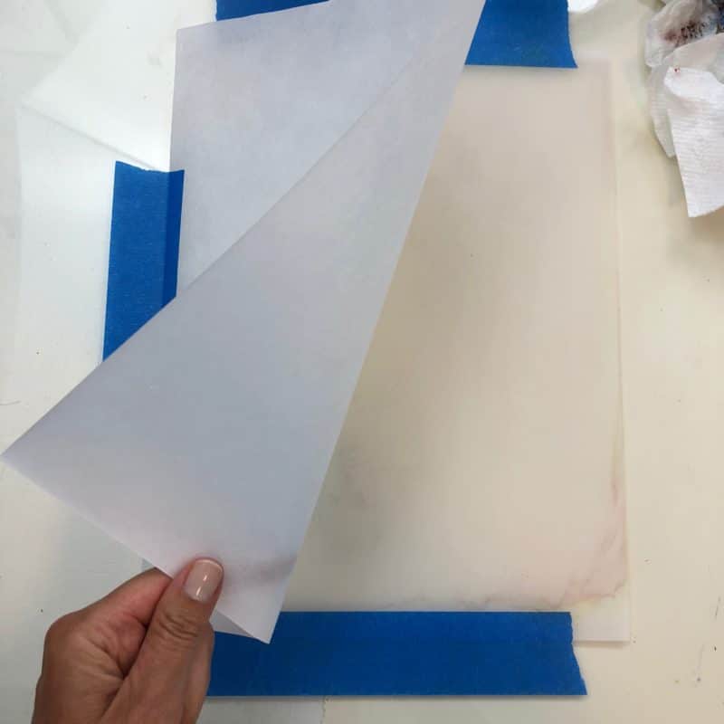
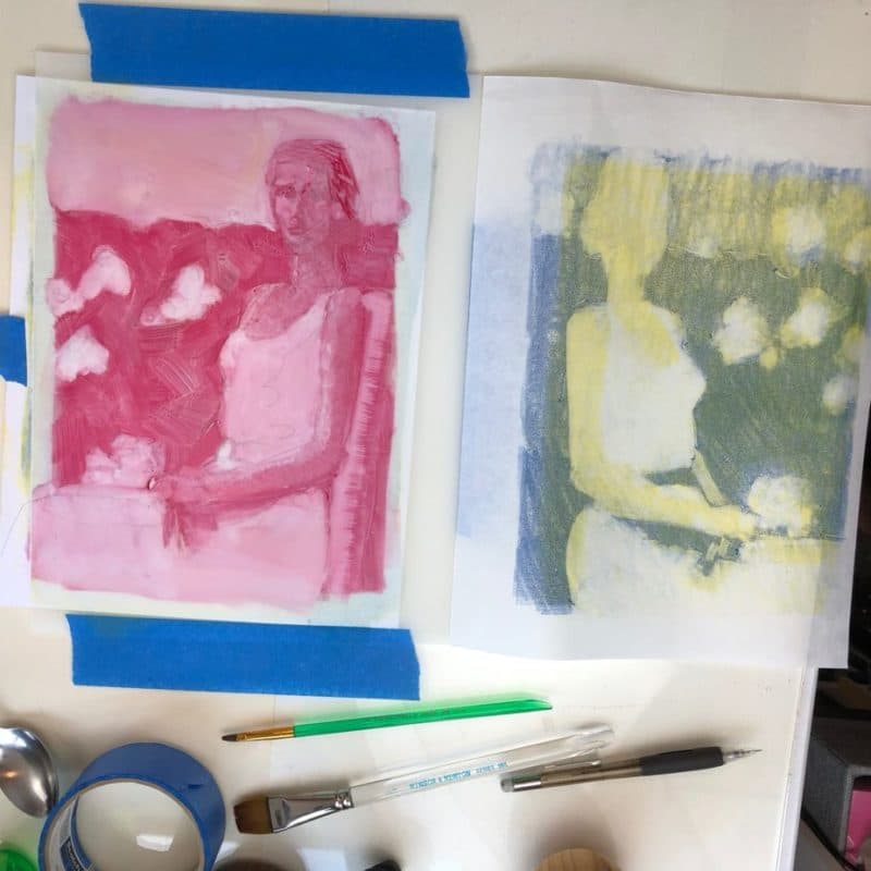
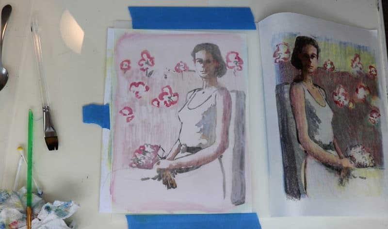
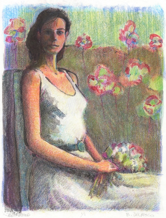
By taking photos of your process, it helps you review working steps in retrospect. I planned to use four colors on this print, so they were laid out and ready, and by gosh, I was going to use them all!
Sometimes, we hinge a plan to our vision for the final project so much that we miss opportunities to stop ahead of the finish line.
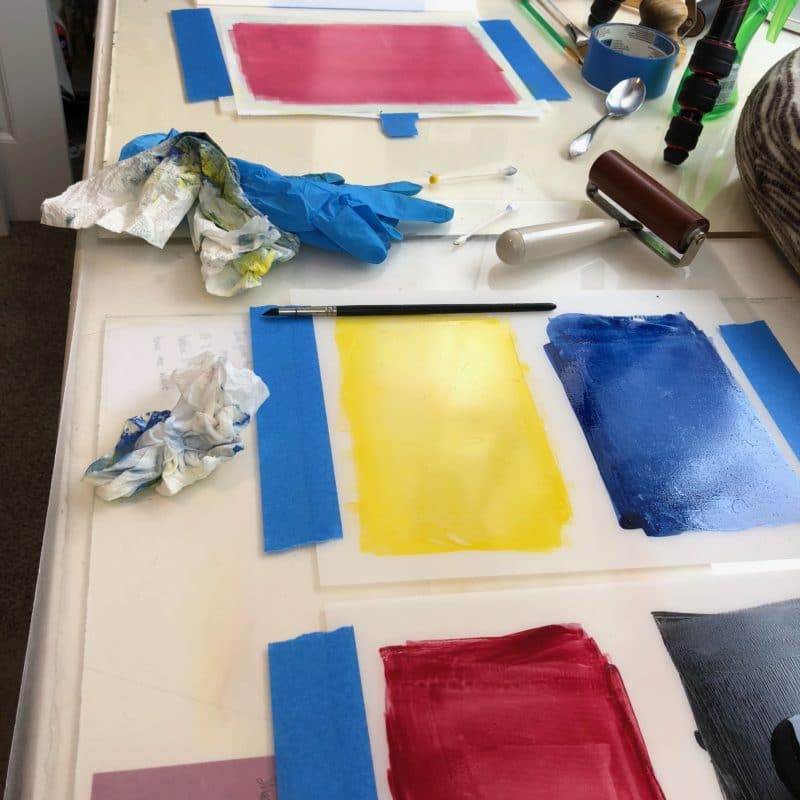
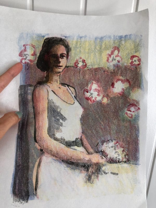
This stage of the print (above) – just three colors – yellow, blue and red – would have been a great place to stop working. The colors are soft and close in value, which would have lead to a layer cake of color-wizardry fun using other media.
But I never noticed this perfect place to pause and consider – till I saw the video. I was too focused on using four colors, and capturing all the steps on video.
Moral of the Story:
Take photos of your process. It’ll slow you down, make you look. It pauses the creative-frenzy of Making long enough to consider alternatives to the original plan. At the very least, photos will give you fodder for your blog posts and social media.
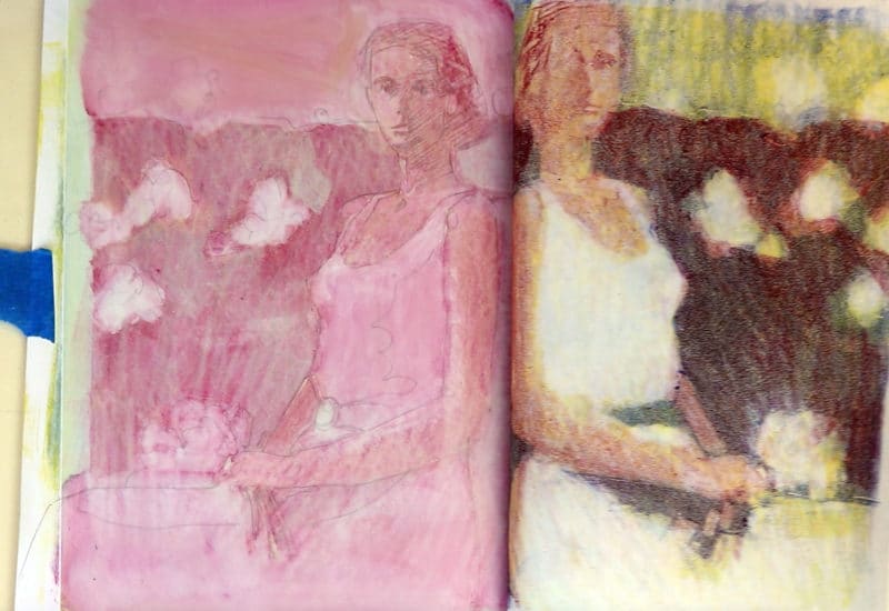
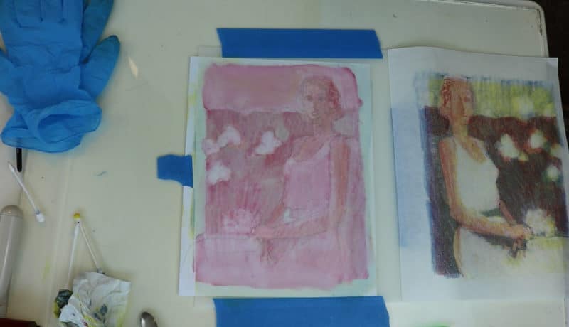
Adjusting Your Print with Colored Pencils
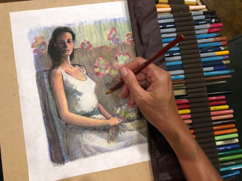
The thing to keep in mind about colored pencil repair on printmaking is that they do a fabulous job of darkening an area, or lightening an area, if the pencil sticks to the ink, or it can make contact with the paper.
Colored Pencil works beautifully while still preserving the soft-edge integrity of a monoprint.
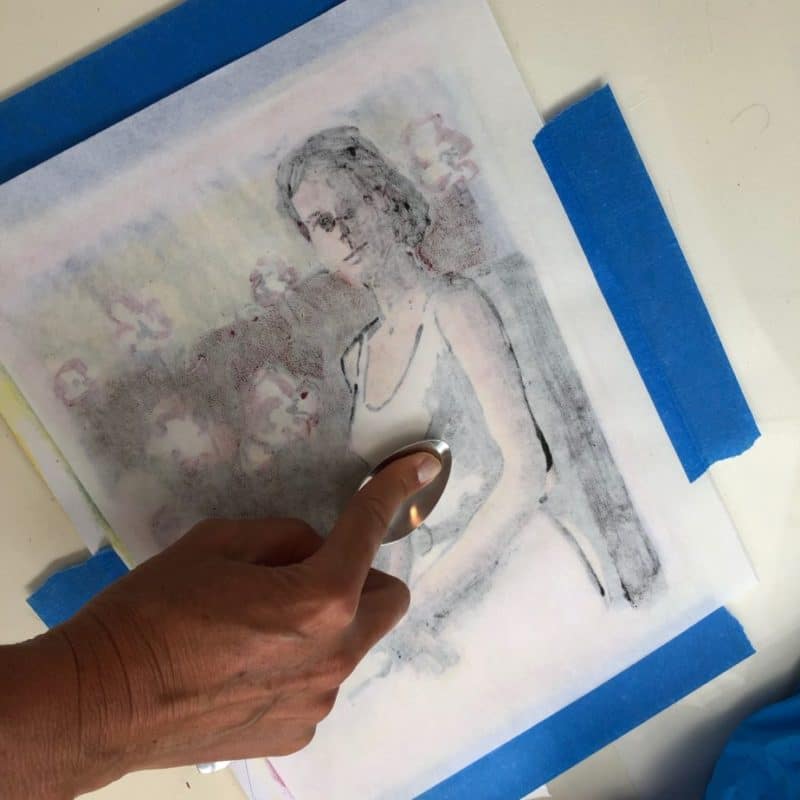
You can layer veils of color over something too light, or shade in a few hints of details if your pencil can still grab the tooth of the paper (like this one), because your ink application was light enough to leave access to the texture of the paper. Adding dry media also works very well on oil-based inks; in my experience, colored pencil sticks to most oil-based inks like chalk on a board. But this is water-soluble printmaking ink.
This Calls for Experiments!
If your ink layers completely obscure the paper’s surface, know that some water-soluble inks are slick and/or shiny when they dry, and most colored pencils are made with a wax and pigment base, so they just slide over the ink without leaving color behind.
Your choice of paper will also affect this too; heavier weight BFK Rives and Arches Cover have enough tooth under the ink to collect colored pencil, but those thicker, stiffer papers work best with a press.
If you’re printing by hand on thin papers (recommended if you don’t have a press), and you plan to add colored pencil to a monotype printed with a slick-surfaced ink, lean towards printing lighter colors in thinner layers so you can still get your colored pencils to grab the tooth of the paper underneath the inks.
This will take some experimenting with your particular supplies to see what you can and can’t do, but that’s half the fun of working with our hands: playing with supplies. Take a deep breath, mark the session you’re planning as a Test & See, and pull some failed prints over to your colored pencils and other media to test a few small repairs. On your mark, get set, GO!
Thanks for stopping by, and I’ll see you in the next post!
Belinda
P.S. You can subscribe to this blog so each new post will land in your inbox. Sign up (free) here.
Art Quote
One of the hardest things to do is separate your work and the effort that you put in from the results. If your happiness with your job and your career is dependent on how the movie does at the box office or how the critics respond to your role, you have placed your happiness with your own life in the hands of other people, and that’s a recipe for profound disappointment.
Ryan Holiday
I am always thrilled as you share your process – I am itching to get in the studio. Btw I like that pencil holder sleeve – where can I get that – rather than having my pencils in a can? Thanks for the inspiration.
Hi Sheila! That pencil holder rolls up and travels well, and I keep it in a tote bag to move around the house for stealing little moments of art-time. Mine is made by Derwent, and I got it on Amazon: https://amzn.to/2MmWIab I’ll probably buy another that holds 70+, or perhaps another just like the one I have which holds 30, as I often wish I had more colors when I’m working on something away from the studio. If you like lots of color, select one with many pencil slots. 🙂 And thanks for the compliments. I’m grinning that these missives are helpful.
Fantastic post! Love your work, and your very detailed descriptions of how to make your art.
XOXOXOXOXO
Thank you, my friend! Your encouragement, good-vibe and targeted kindness goes directly into my artist-heart-vault. XOXO
Goodness Belinda, don’t be so hard on yourself. I think both the third color and fourth color stages of this print each have their own good qualities. In my experience with the CMYK process your using, it’s the K that pulls the previous three colors together and makes everything pop. My preference is for your final print. The colors look richer (colorier) next to the black, which also lends dimensional form to your model with shadows. And just look at how much more animated and expressive her face is than with the three colors. Your work is lovely, and this final print is no exception. BTW, I hope your video includes the colored pencil enhancements at the final stage. I’d like to learn more about how you work that. Also, I use soap-n-water inks too (Akua) so any tips regarding using colored pencils with that would be helpful as well. Do the oil-based pencils (Faber-Castell, for instance) work better than the wax-based ones like Prismacolor? Thanks so much for your comprehensive and frequent contributions to the community. I’m always excited when I see your name in my inbox!
Hello Hans,
Thanks for your kind encouragements. When I look at the three color print, I could have had SO MUCH FUN enhancing suggestions of features, rather than hard-edged, high-contrast features, which came with the black ink. I agree with you that black usually pops the combination of colors into place perfectly (yes, colorier!), but I still think I should have stopped. Thanks for the pat on the back, and your compliments. 🙂 The upcoming video doesn’t include colored pencil fixes, but I can add that to the video list. This print was made with AkuaKolor liquid pigments, and the pencils are wax based Berol prismacolor. <---These work very well on oil based inks, but the light pencil over thicker, dark ink Akuakolor doesnt stick. I've never tried Faber-Castell... do you like them?