5 Tips for Your Artist Newsletter
How often do you send a newsletter or email to your followers? If the writing segment of your art studio tasks seems insignificant, or the thought of word-smithing gives you a rash, here is a post about why it’s so important.
Below are some tips to help with artist newsletter particulars. Pretend we’re setting in a cozy kitchen, and I’m handing you a cup of tea and a cookie. It’ll make the topic of creating a newsletter easier.
1. Branding
Use a banner logo at the top, or the header, of your newsletter. (If you don’t have a logo yet, see below.) No image software? You can build a banner on Canva. Be sure your name is on your banner, because you are the brand/artist. (Not sure how to get started with this? Check out this newsletter course by Jeff Goins.)
Create a newsletter template so your logo is visible in every missive you send out. Design your banner as a slender, horizontal image to fit across the top of your newsletter. Make it simple. Change it often to keep things fresh, and to stop yourself from getting too fussy and stressed about making The Perfect Banner. By the time you design your 12th banner, you’ll be excited to make new versions.
If you don’t know what to use as a logo, try layering a section of one of your paintings as a background, or a photo of your art supplies, or your work table, or your face, or hands, etc. Add your name to your background image, and add your media, or your website, or your email address (See below).
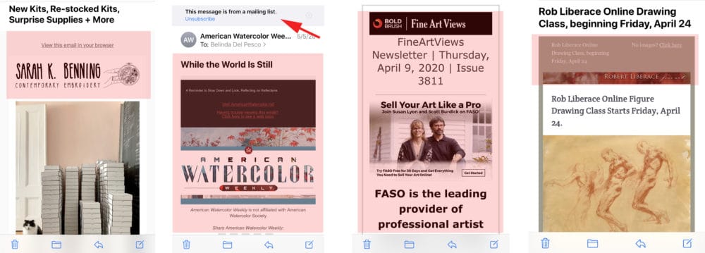
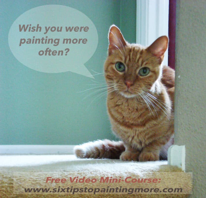
These days, email programs are adding a mailing list banner warning to help automate unsubscribing (see it above the American Watercolor banner), so the graphics are pushed even further down the screen.
2. Layout
Square logos at the top of your email will block all the content beneath it (see above). On mobile devices (46% of all email opens are on mobile), recipients will only see your square banner on their screen. If you send the same blocky header in successive newsletters, there’s nothing new to entice your reader to open your email and see the art. Don’t make your recipients scroll your logo out of the way just to see the contents of your newsletter.
In your newsletter design, insert an enticing piece of art so it’s visible without scrolling, and add a compelling headline. So, in order of appearance, your slender banner and a good headline/subject goes at the very top, , above your first beautiful painting, followed by your first paragraph of text. Make sense?


3.Where Are You?
Create a signature block that includes a series of links to your blog, website and etsy shop – or wherever folks can get more details about you and your work. Include your email address. And if you know how to create a link, you might consider making your email address into a text link that says Get in touch with me!
Save that signature block, and make sure it’s inserted automatically in all your outbound emails, and it’s on your sign off in all newsletters. If you use Microsoft office, here is an article about building a signature block.
4.Volley the Conversation
Be clear about how to get in touch. About half of the blogs I subscribe to don’t have their email address configured as the sender of their posts. If I hit reply to say something about a blog post I just received via email, or to ask about a painting I like, the email address is a No-Reply, and won’t work. Confirm that the “reply to” in your newsletter is coming back to your studio email address, rather than the default “no-reply” email address.
Invite your audience (in every missive) to get in touch with you. Make the Get in touch invitation a link connected to your email address.
Encourage sharing of tips and short cuts they use in the studio, or images of new art they’ve collected. Ask what they’re working on, and how they’re doing. When they grace you with a response, reply promptly. Your subscribers are your tribe.
5. One on One vs Addressing the Auditorium
When writing your newsletter, speak to a single person, instead of a Hey Y’all crowd.
Each person receiving your note is reading it alone, from a screen they’re likely holding in their hand. Talk to them as though you’re sitting on a porch swing, yakking about art. Just like you and me right now.
You’re not reading this post from a prompter in a room of eight thousand folks. I’m speaking to you, alone. And when you reply to this, or leave a comment, you’ll be speaking directly to me, because we’re art buddies, the two of us. 🌞🌞 Right?
Thats what makes this whole endeavor amazing and magic. Connection has never been more important than it is right now. Making art is a loner sport. All that solo-time with art supplies and ideas is a vitamin for the soul. But humans need connection, so we balance that creative time with a little sympatico chit chat over tea and cookies.
That’s what a newsletter or a blog post is in its simplest form. A hand reaching out to shake your hand and ask Hey, How are you today? What have YOU been up to?
Thanks for stopping by, and I’ll see you in the next post!
Belinda
P.S. If you’re wondering how to get traffic to your website or blog, this new series about Google Search might be just the thing.

Art Quote
A pure blue pigment, Cerulean Blue is opaque and bright due to its highly refractive particles. It is stable and does not react to light or chemicals, making it a permanent and invaluable part of the artists’ palette.
Winsor & Newton
For a clue to its name origin, you need to look upwards. The word cerulean comes from the Latin caeruleus, meaning dark blue caelum, which in turn probably derives from caelulum, meaning heaven or sky.
After the discovery of Cobalt Blue by French chemist Louis Jacques Thénard in 1802, the Swiss chemist Albrecht Höpfner first created Cerulean Blue from Cobalt stannate in 1805. It is made by the calcination of tins, salts and silica with cobalt sulphate and is an inorganic synthetic mineral pigment. It took a while for the colour to become widely available to artists – over 55 years in fact – and was introduced in the 1860s under the trade name Coeruleum.
Cerulean Blue was quickly adopted by artists, including the Impressionists, because of its hue, permanence and opaqueness. It was particularly useful for skyscapes and can be found in the sky of Monet’s 1877 ‘La Gare Saint-Lazare’ the pointillism of Paul Signac and in Édouard Manet’s 1878 ‘Corner of a Café-Concert’.
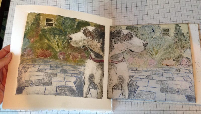
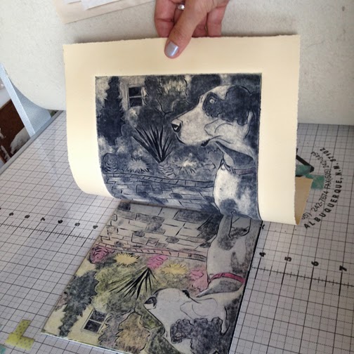
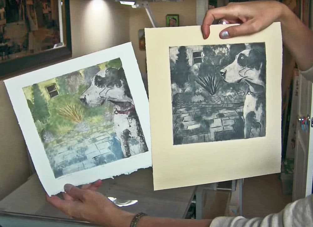
Thank you so much for another motivational message, Belinda! I save your newsletters and blog posts for times when I can savor them. I will come back to this one to review the collagraph technique in more detail. This particular message is as tasty as a homemade cookie. Again, thanks!
Hi MaryLiz! I hope you are safe and healthy in this strange time, and the details of the collagraph print inspire you to give it a try! Thanks so much for your kind note. Today’s cookies are peanut butter made with chopped peanuts – so they’re crunchy. Half the batch is soft (for my husband) and half are crisp (for me). You get one of each!
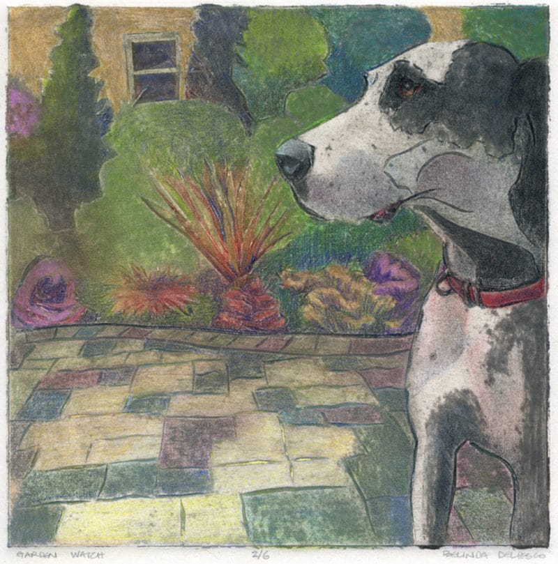
Useful tips from someone who knows and also does! Belinda, another excellent article but these graphics are just something else. The high contrast between the color and the monochrome dog collograph prints was eye-catching.
Hi David! Thanks for your feedback & compliments! I’m glad you like the great dane too. She was our neighbor. Stella was a big, sweet pup who loved granny smith apples. I appreciate your note. Thanks for the visit.
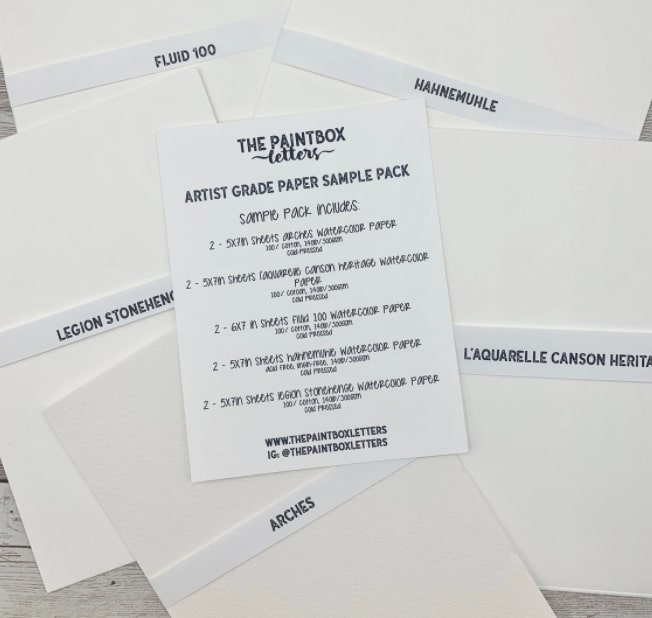
Hi Kendra! Today’s cookies are peanut butter pecan, and we’re having iced coffee with them. Make yourself at home! A watercolor paper test pack is an excellent way to get acquainted with different papers. The Legion Paper company also sells drawing paper sample packs, and printmaking paper too, but they are frequently out of stock. If you get this paper sample pack, let me know which one you like best. Was the journal paper smooth, or toothy? And could you lift color from it with a wet clean brush?
Well, thank you, I would LOVE a cookie! Always enjoy your posts and the items and links you share. I am thinking of ordering that sample pack of watercolor paper or something like it. I actually painted some watercolor circles that morphed into balloons and I liked the paper; it was part of a “journal” and was a thick cotton paper apparently (no info offered). It was very forgiving, anyway. Thank you for keeping in touch. – Kendra